

After several years of teaching college students, it occurred to me that it may be helpful for me to discuss the development of my art. One does not just emerge doing highly metaphoric abstract work. When I began my college career, I could not have imagined doing the art that I do today.

I came from a high school art program that, in large part, reproduced images from magazines. My early college work was also in a largely representational tradition. In fact, it was the praise that I received from producing representational work that really engendered my interest in art. Early on, my interest in ideas (I began college as a double major in economics and philosophy) was, for me, completely different than my artistic production. At that point in my life, fine art was not even within the realm of possibilities as a career. I enjoyed it, but it was really just a leisure activity, not something to be taken terribly seriously. I do not fully know when the change occurred. But slowly as I became more invested in my art, ideas became more and more central to it. The first glimpses of a focus on concept and a heavy use of metaphor appeared just before I transferred to Pratt Institute in Brooklyn, NY, more on that later. But, it took a good while for this shift to take hold.


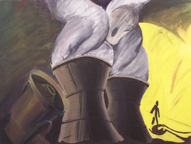
One of the earliest concepts that I dealt with had to do with my childhood experience. As a child, I grew up near a nuclear power plant. Near enough that we would get sent maps telling us how long we had to evacuate if there was a problem. I do not remember the exact time frames; but, I remember that our house was in the red zone. Also, across the street from our house stood an early warning siren. While that would seem comforting, it really was not. The siren would often go off as a test and I had no idea if it was the real thing or not. Maybe my parents had received notification, but it had not been passed down to me. As a result, when the siren would sound I really did not know what to do. Eventually, after a certain amount of time had passed, I would assume that I was going to live. I do not know if other kids during the late cold war had any real sense if impending doom but for me, it was a very real concern. As a student in New York, this theme found its way into my work. In fact, I still think about this work from time to time and consider returning to the theme.

Simultaneous to my work with nuclear power plants and the associated fear, I began a series of work that still continues to this day. I have often recited the generative story of this work. In graduate school, some students heard it often enough that they would prompt me to tell the story to a new professor. So, here it is… Before I transferred to Pratt, I spent a semester at Sacramento City College. One day, I was sitting in the cafeteria. Sac City, at that time, was diverse but not terribly integrated. The cafeteria was full of round tables. Seemingly, each table had students from different ethnicities. There were tables with Hispanic students, Asian students, Black students, and White students. I remember seeing an Asian student stand up from his table and weave his way though a variety of other tables and then sit down at another table with other Asian students. At that point, I sketched the first of what I would eventually call Societal Portraits.

I cannot, however, pretend that this was some sort of epiphany. As noted earlier, I continued to work, after this sketch, without any real dedication to concept and I worked with other themes before settling on the Societal Portrait theme. Eventually, though, they did become an obsession for me. For many years they were my primary theme and even now, just over fourteen years after that initial sketch, I still work with the theme.
The next few Development of an Artistic Voice posts will focus on the evolution of the Societal Portraits. The good, the bad, and the REALLY ugly aspects of their development. Fortunately, at least for my ego, there are literally dozens of Societal Portrait paintings and drawings that no longer exist and were never photographically documented.
I hope that this exploration of the development of artistic voice will be helpful for some. Indeed, I expect the nostalgic benefit for me to be immeasurable.
When I first sketched out the idea for the Societal Portraits, it was my intention to have each area be a different color. That first sketch has a key which indicates that I was intending one particular type of mark to represent brown, another black, another yellow, another red, and another white. Embarrassingly, it seems that I was intending each area to stereotypically represent colors typically associated with different races. There is a certain amount of logic to this since my sketch came from watching people groups but it was also terribly literal and simplistic. Fortunately, this hyper literal approach was dropped very early. In fact, I do not remember executing a single painting with this sort of scheme. The color scheme instead quickly evolved to a more vibrant palate. What I did not know at the time was how important vibrant color would be to my work in the long run. However, as I look back on the work now, I can see how I was in the inculcate stages of my fascination with color.

I always tell my students, who are frustrated with their work at the undergraduate level, that I spent a couple of years doing bad work, then a couple of years doing okay work, and then finally progressed to where I was doing solid work. Much of the work that I am referencing in the “couple years of bad work” comes from this series. Thankfully much of the work I did in this series was destroyed and there is no photo documentation. I don’t know exactly how much work I did during this period but there were probably a couple dozen paintings and a dozen drawings. I only have photographs of three paintings, one of which is destroyed, and four drawings. And from those remain only a couple which my pride feels comfortable sharing.

Ultimately, this series ran its course not because I had accomplished everything I could accomplish within the limitations of the series but because the limitations of the series would not allow me to take my work where I wanted it to go. Though if I am honest, I must admit that when I finished working on this series I thought I was leaving the series in victory not defeat. I guess time can change ones perspective.
The lessons I learned from this series, however, were valuable and they helped fuel my continued work with the Societal Portraits.
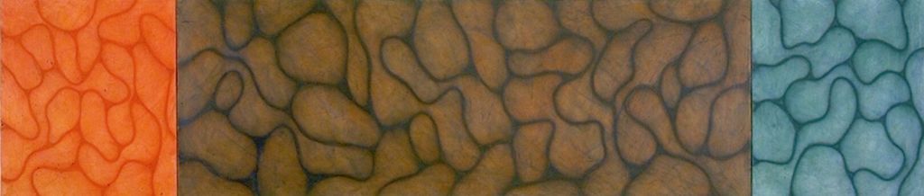
Rondall Reynoso, Root, oil, acrylic, charcoal, & collage on canvas, 28″ x 62″, 2000

When I first thought up the societal portraits, I envisioned paintings very close to what I was doing in the Polychrome Series. But after a short while, It just wasn’t enough. Part of my challenge was that I was struggling with color. Color is hard and in the series I was just throwing all the colors into the work and I did not have a strong sense of how to effectively use it. I finally made the choice to limit my palate. I had also taken a course on artistic materials and I became interested in experimenting with materials. Finally, I felt that my work was flat both literally and conceptually so I was looking for ways to add layers of meaning and physicality.
In my paintings, I transitioned away from oil paint to a mixed media process. I had learned in my materials class that matte medium can be used to glue down paper. I began my new process by glueing paper down on my canvas. The type of paper depended on the concept of the painting. It was typically newspaper at times related to a theme but I also used pages from the New Testament. The next step was to draw my biomorphic shapes on top of the paper in charcoal. I used vine charcoal so that the lines would dissipate as I worked on the painting. The final letter was made with oil sticks which for those who don’t know are basically really large oil based crayons. The oil stick work was then gone over with a thinner to blend the colors and break down the lines themselves causing dripping from one form to another. Probably the most drastic change in the work though was the change of palate. I abandoned the bright colors for earth tones as I was seeking to bring a greater sense of gravitas and history to the work.
In this series, both the composition and the collaged text gave hints to the concept driving the work. The piece Conventional Wisdom was painted on newspaper as a primary source of wisdom still in 2000 and one rectangle is centered while the other is to the side. Root was painted over the financial pages from the New York Times then there was some free form writing referencing the concept that the love of money is the root of evil. Finally, the composition of the piece clearly references money. The painting There is no Grey is painted over the New Testament with a composition that references the narrow path. The untitled drawing here more broadly references my overriding concerns in this series which were about juxtaposing and integrating the idea of the biomorphic shapes referencing a sort of “natural” humanity while the geometric forms more broadly reference our constructed culture.
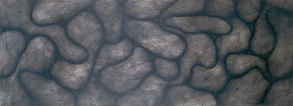
The Stratum Series is an excellent example of something good coming out of complete failure. When I was working on the Hatching Series I noticed that the paper I glued down became translucent. Since I was working with layers, I decided to see if I could draw under the paper and have the drawings show through adding an additional layer. It was a complete failure. Once the paper dried, the drawing underneath could not be seen at all. But, I really liked the how the charcoal looked when I spread the matte medium to glue down the paper. This led to an innovation in painting style that I have used ever since. The painting above is the first to use my new layering process where I draw in charcoal, or later pastel, and then spread it with matte medium, sometimes mixing in gloss or other mediums. In this particular painting the process was only repeated a couple of times but in future paintings it was repeated sometimes over 20 times.
I also liked how this method of painting worked with my visual metaphor. The societal groupings that my imagery referenced were not something that happened out of the blue. They have a history. I liked that with this method of painting, and the transparency, the literal history of the painting and metaphorically the social groups could be seen.
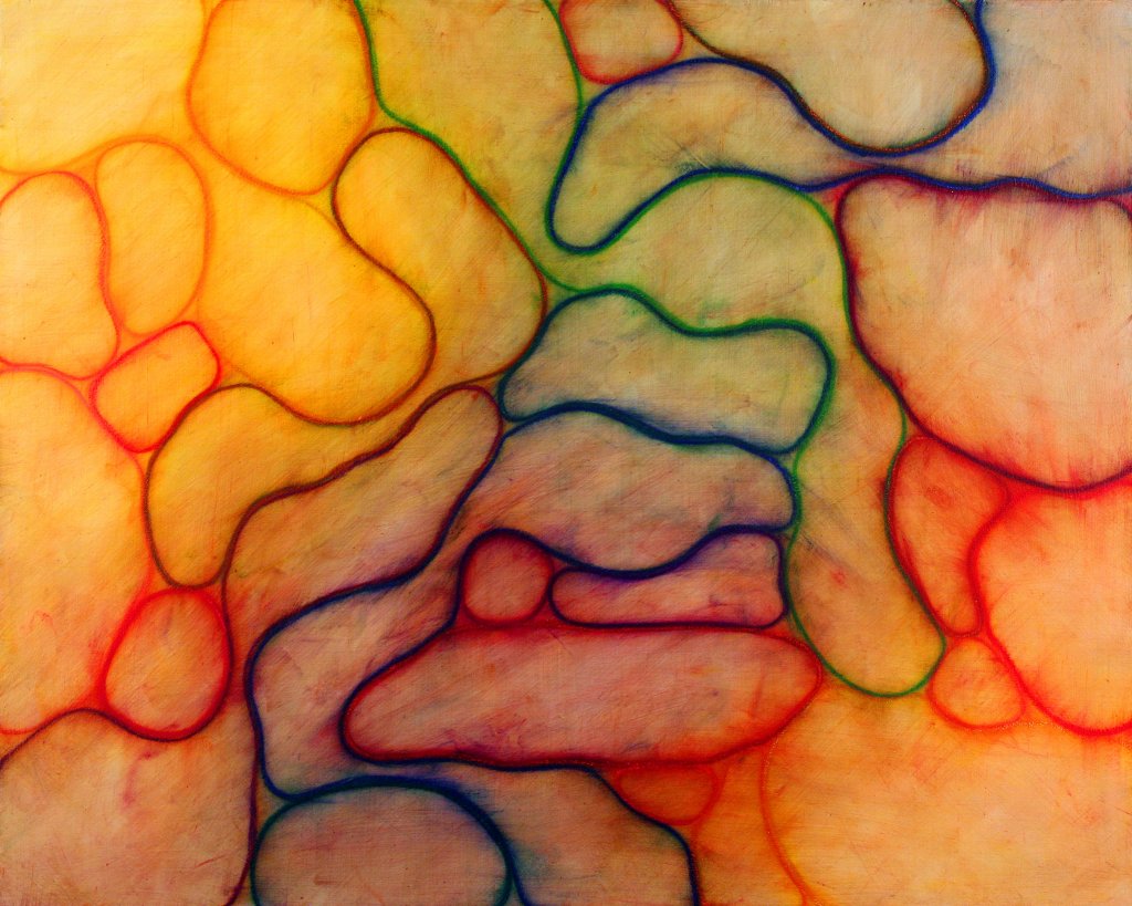
One of the challenges with this method of painting is how to use color. My early solution was to isolate colors to individual canvases. In the piece above, Sheol, ‘Erets, Shamayim, each canvas was a different color. That does not mean that the colors were simple. For example, the brown in the middle canvas came about by mixing multiple blues and oranges and the blue and orange canvases were also more complicated than one simple color.
This piece also continues to develop my use of metaphor. The title is based on the Hebrew words that are translated Hell, Earth, and Heaven in the Old Testament. The piece is panoramic and meant to reference the entirety of human existence.
As I continued working in this way, I became more loosely tied to the metaphors. I also gained a greater control over color. I still do works that separate color by canvas but some of my favorite works work with color in a much more sophisticated way. The piece below, Covenant III, is a good example of a more mature use of color. This one has actually become one of my favorite pieces to the point that is hangs over my bed.
This series was my primary artistic production for many years. Even in the pieces shown here they cover nine years. I still work with this series some. But, my artistic production has expanded. However, this series is at the heart of my visual voice and will likely be something that I play with for the rest of my artistic career.
One thing that I discovered while working on this series is that I really enjoy taking the same basic imagery and moving it through a variety of mediums.
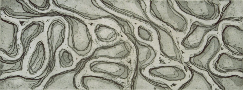
That is exactly what I did in the print above. I hade been making prints for a few years but in this work I was striving to find a way of taking the layering process I was using in my acrylic and pastel paintings and referencing it in my print making. Of course the mediums are very different an ultimately the final product looks very different. But, this is exactly the transformation I like- exploring what happens when an idea moves to a different medium. In this process, I paint hard ground (a resist that keeps the acid from eating the plate) onto the copper plate and submerge it into the acid. I then take it out clean it and repeat the process. Eventually, I end up with a plate will print like the image above. The plate is also deeply etched which means the paper embosses in addition to prints.
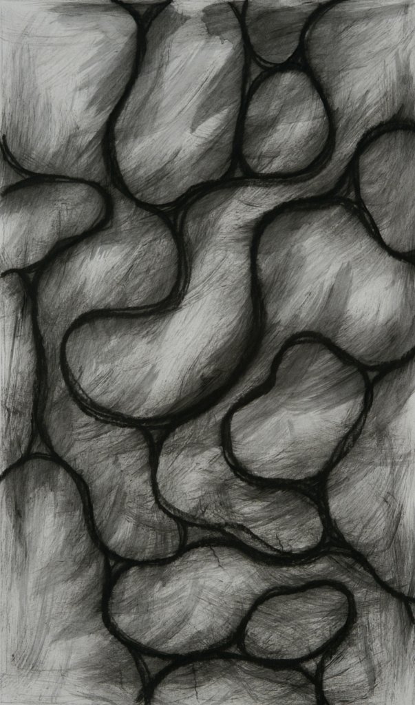
In the drawing on the right, I am trying to adapt my process to pure drawing without an acrylic medium. In this series of work, I drew on the paper with charcoal just as I would have on canvas. Then, rather than laying down an acrylic medium to spread the charcoal I took paint thinner and a cheap chip brush and spread the charcoal. The cheap brush helped give a very streaky feel that I enjoyed and the thinner allowed the development of washes and even drips. I repeated this process layering new lines on top of old just as I had done in the paintings and etchings.
I have always loved oil paints. There is something about the feel and even the smell that I find very compelling. One thing I lamented with my new developing style was that I was no longer working with oils. So, for a period of time I sought to take a similar process and produce oil paintings. Painted the forms in oil and then layered glazes over them to create a subtle luminosity. There is something about these works that I still find compelling. A real sense of visual depth in a very flat surface. That and the sense of light that emerges from within the painting. I only did a few works like this. My favorite was a red one, the same size as this, but they were terribly hard to photograph and this one shows the forms more clearly.
12″ x 12″, 2002
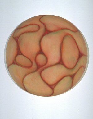
Another way I experimented with the Stratum Series was to paint on shaped canvases. In this work the drips that happened over the edge had always been very important. However, the shaped portrait canvases allowed for something very different. They instantly began to reference cellular samples under a microscope. This one very intentionally references both blood and the social groupings which these forms had always referenced. Initially, these pieces displayed individually but in time they evolved to be grouped in large wall displays allowing the canvases to interact as pieces of a larger composition.


Beautiful work Rondall!
The very first day I moved to Herald, as soon as I got out of the pick up and closed the door, the sirens went off. Rancho Seco was pretty much in our back yard, in full view. As the sirens started blaring my dad and I also noticed a semi-truck hauling ass out of one of the back roads of the plant. You could hear the driver crunching through the gears trying to get out of there as fast as possible. Pretty surreal welcome to our new home in the country. Luckily, just turned out to be a phony bomb threat someone had phoned in. I still love the sound of those sirens to this day. I wish I could have one.
I remember the last years of the cold war very well. How it impacted everyone’s thought process. My fear levels were certainly elevated pretty much through the entire 1980’s. Had several dreams as a teenager about nuclear bombs going off and mushroom clouds dotting the horizon in all directions. I definitely felt that impending sense of doom you mentioned.
Keep up the good work, sir!
[…] you have not read Part 1 of this series you may want to do so prior to reading this installment. Rondall Reynoso, Sketchbook […]